-

Showing posts with label OUGD303DP. Show all posts
Showing posts with label OUGD303DP. Show all posts
Wednesday, 29 May 2013
Tuesday, 28 May 2013
Pilgrim (Self Promo) - Brief 5 / Presentation Boards
-
Presentation boards for the self-promotional Pilgrim project. This is was a brief that solely focussed on something that I wanted to do without any real explanation for an audience as I did not feel it was necessary. Overall I feel that the photographs do the project justice and create a well balanced brief.
Presentation boards for the self-promotional Pilgrim project. This is was a brief that solely focussed on something that I wanted to do without any real explanation for an audience as I did not feel it was necessary. Overall I feel that the photographs do the project justice and create a well balanced brief.
Hedonistic - Brief 6 / Presentation Boards
-
Hedonistic presentation boards, this is an additional brief so I have only produced two as I do not feel that there needs to be anymore to explain the brief. The illustration I have created is one of my favourites of the FMP module so I want to showcase it in a presented format.
Hedonistic presentation boards, this is an additional brief so I have only produced two as I do not feel that there needs to be anymore to explain the brief. The illustration I have created is one of my favourites of the FMP module so I want to showcase it in a presented format.
LOTR - Brief 3 / Presentation Boards
-
LOTR final presentation boards that showcase a product range and the illustrations that I have produced for the project. This was a bit of different direction with my practice, but I'm happy with how the visuals.
LOTR final presentation boards that showcase a product range and the illustrations that I have produced for the project. This was a bit of different direction with my practice, but I'm happy with how the visuals.
Visual Resistance - Brief 7 / Presentation Boards
-
Although I am not supposed to make boards for this project, I feel that it needs to have some. Purely because I spent a lot of time designing the layout and building up the content. Overall I am pretty pleased with the final outcomes.
Although I am not supposed to make boards for this project, I feel that it needs to have some. Purely because I spent a lot of time designing the layout and building up the content. Overall I am pretty pleased with the final outcomes.
Dirty Money - Brief 8 / Presentation Boards
-
Final presentation boards for the Dirty Money album artwork brief. Again the photographs exaggerate the project range in a high professional standard and I feel happy with the final outcomes.
Final presentation boards for the Dirty Money album artwork brief. Again the photographs exaggerate the project range in a high professional standard and I feel happy with the final outcomes.
YCN - Brief 1 / Presentation Boards
-
Final presentation boards for the YCN Uk Greetings brief. Overall I feel that alongside the initial illustrations and product range, the photographs have visually increased the aesthetics of the overall brief.
Final presentation boards for the YCN Uk Greetings brief. Overall I feel that alongside the initial illustrations and product range, the photographs have visually increased the aesthetics of the overall brief.
Visual Resistance - Final Product Photographs
-
As this brief was one of the only strongly design related projects, I thought I would design some boards for the publication. Although I am an illustrator, I do enjoy graphic design also and particularly book making. Although time consuming it is something I want to carry on alongside. Anyway here are the project shots, which in my eyes effectively showcase the elements of the publication which I think are the strongest.


As this brief was one of the only strongly design related projects, I thought I would design some boards for the publication. Although I am an illustrator, I do enjoy graphic design also and particularly book making. Although time consuming it is something I want to carry on alongside. Anyway here are the project shots, which in my eyes effectively showcase the elements of the publication which I think are the strongest.


Pilgrim - Final Product Photographs
-
Final product shots of my self-sort-of-promo Pilgrim project. The wanderer. As the overall concept was to develop a series of products that host my illustrations as the centre point but aslo carry a DIY punk ethos. The patches stand out on their own, and even better once incorporated onto a product. Initially I wanted to take photo's of these within a staged anarchistic environment, but due to time management I have had to cut a few corners. Yaf, mooney and eddie helped me out and stepped in as models. What was interesting was the fact I literally just took photos of them messing around, being normal and skateboarding. This alone fits directly with the initial direction and audience in which I want to aim my illustrations at.


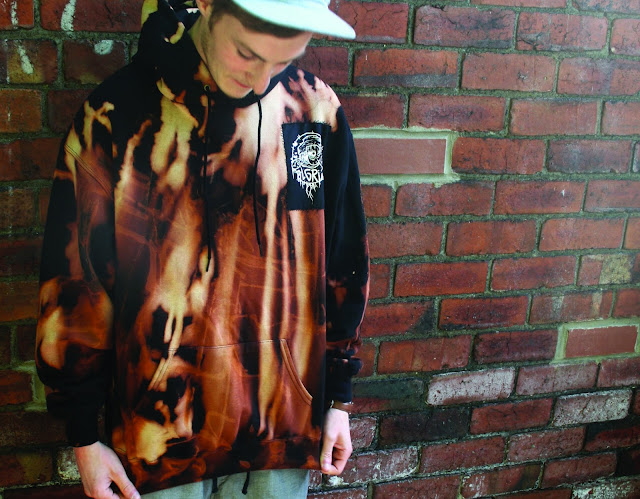


Final product shots of my self-sort-of-promo Pilgrim project. The wanderer. As the overall concept was to develop a series of products that host my illustrations as the centre point but aslo carry a DIY punk ethos. The patches stand out on their own, and even better once incorporated onto a product. Initially I wanted to take photo's of these within a staged anarchistic environment, but due to time management I have had to cut a few corners. Yaf, mooney and eddie helped me out and stepped in as models. What was interesting was the fact I literally just took photos of them messing around, being normal and skateboarding. This alone fits directly with the initial direction and audience in which I want to aim my illustrations at.


Dirty Money - Final Product Photographs
-
Spent more time on arranging these products with space this time, and they sit together alongside each other even more effectively than I anticipated. The red is striking and the black and whit keep the colours from standing out too much. The vinyl and cd's stand out on there in own which is basically the overall intention of producing album artwork, so it will increase the face value of the bands music.


Spent more time on arranging these products with space this time, and they sit together alongside each other even more effectively than I anticipated. The red is striking and the black and whit keep the colours from standing out too much. The vinyl and cd's stand out on there in own which is basically the overall intention of producing album artwork, so it will increase the face value of the bands music.


YCN - Final Product Photographs
-
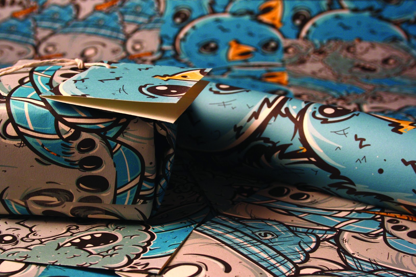
DIY studio product shots of my Greetings brief. These have came out really well and as a range the printed media sit nicely against one another. I particularly like the close up shots as the blurred background creates a nice background for the illustrative product. Also this demonstrates a different approach to manipulating my illustrations as a repeat pattern can effectively change to impact in a certain context. Something to think about for future briefs.


DIY studio product shots of my Greetings brief. These have came out really well and as a range the printed media sit nicely against one another. I particularly like the close up shots as the blurred background creates a nice background for the illustrative product. Also this demonstrates a different approach to manipulating my illustrations as a repeat pattern can effectively change to impact in a certain context. Something to think about for future briefs.


LOTR - Final Product Photographs
-
The final product photographs for the LOTR project. The publication does not in my eyes visually meet its potential but the A2 prints are more effective than I originally anticipated as the colours work better than I initially intended. The type sits quite nicely next to each one, and together with the publication they make quite a nice range.


The final product photographs for the LOTR project. The publication does not in my eyes visually meet its potential but the A2 prints are more effective than I originally anticipated as the colours work better than I initially intended. The type sits quite nicely next to each one, and together with the publication they make quite a nice range.


Dirty Money - Merchandise Mock-ups
-
I should have done these ages ago as part of the range, but due to lack of time management I have forgot about merchandise. This seems run to be parallel in the music industry with the initial songs that artists create. With the designs below I have tried to keep a strong visual aesthetic that effectively relates to the projet overall and thought about how the cotton itself could be manipulated to fit the visual on front. Same with the beanie hats, although it may be difficult to actually produce fabric with these colours. Proposed products.
T-Shirt Designs


-
Beanie's Hats


LOTR - Publication Printed
-
Cutting out and quickly binding the pages together, this is a bit of a naff job to be honest as I had odd stock, which makes the publication look shoddy. Also I did want to print it A3 double sided, but due to financial difficulty I could not. Oh well, it still looks alright.


Cutting out and quickly binding the pages together, this is a bit of a naff job to be honest as I had odd stock, which makes the publication look shoddy. Also I did want to print it A3 double sided, but due to financial difficulty I could not. Oh well, it still looks alright.


LOTR - Final Publication
-
Dun, dun. dunnnn. Finally made it, I've had to cut a couple of corners and water down the project slightly due to time constraints, but this has allowed me to understand that this style of illustration is not the right direction for me. Although the context is there for the visuals, I do not feel that they are all that original as the characters already exist. Drawing from a thought is way more interesting. Anyway, here it is in PDF format.
Dun, dun. dunnnn. Finally made it, I've had to cut a couple of corners and water down the project slightly due to time constraints, but this has allowed me to understand that this style of illustration is not the right direction for me. Although the context is there for the visuals, I do not feel that they are all that original as the characters already exist. Drawing from a thought is way more interesting. Anyway, here it is in PDF format.
Saturday, 25 May 2013
LOTR - Complied Illustrations
-
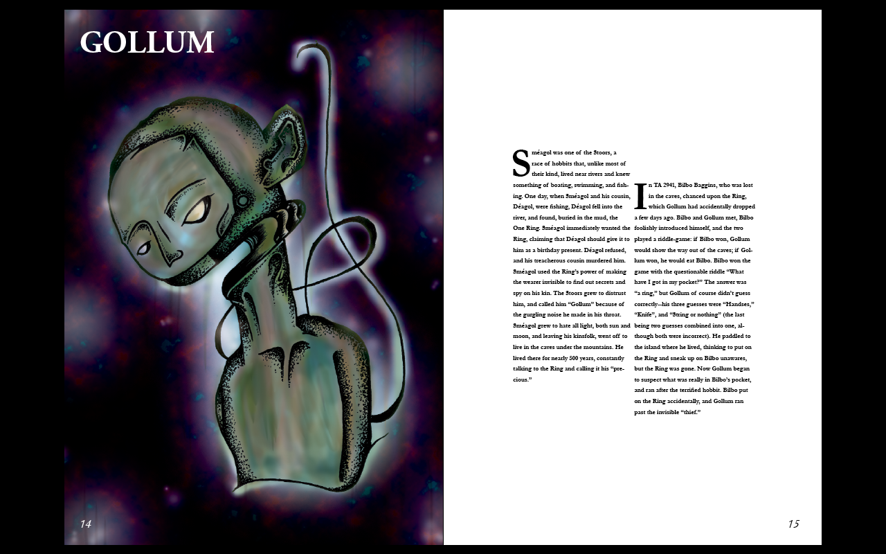
Compiled illustrations from the project, focussing on detailed hand rendered, stippling techniques.
Compiled illustrations from the project, focussing on detailed hand rendered, stippling techniques.
LOTR - Page Spread Development
-
Edging towards the final stages of the publication as I am now focussing on the body text alongside the illustration. Conforming to a consistent layout is boring, so I have changed it up on each page and tried to create something that is equally as interesting as the original image.


Edging towards the final stages of the publication as I am now focussing on the body text alongside the illustration. Conforming to a consistent layout is boring, so I have changed it up on each page and tried to create something that is equally as interesting as the original image.

Subscribe to:
Posts (Atom)