Showing posts with label Brief 8 - Context. Show all posts
Showing posts with label Brief 8 - Context. Show all posts
Monday, 20 May 2013
Mr.Thoms
-
Mural based work by Mr.Thoms, although his work is similar to a lot of artists around the main difference to his work is where he places it. The images below showcase how the environment itself has been adapted to his illustrations. Rather than making the image fit, the wall space has been incorporated. Something that I find interesting.
Mural based work by Mr.Thoms, although his work is similar to a lot of artists around the main difference to his work is where he places it. The images below showcase how the environment itself has been adapted to his illustrations. Rather than making the image fit, the wall space has been incorporated. Something that I find interesting.
Straw Castle
-
Sumbled across Straw Castles work the other week and was instantly impressed by his attention to detail and his biography on the website. It's always interesting to see how someone else has gone about building a platform for themselves by being an illustrator. What I particularly like about his work is the strong visual colour and strokes that build up his fina imagery.
Sumbled across Straw Castles work the other week and was instantly impressed by his attention to detail and his biography on the website. It's always interesting to see how someone else has gone about building a platform for themselves by being an illustrator. What I particularly like about his work is the strong visual colour and strokes that build up his fina imagery.
Saturday, 18 May 2013
Los Angeles Ink Stains
-
This is a pretty random comic book I picked up a while back. Lost Angeles Ink Stains, although I do not know much about the author / artists who have created the publication, but instantly the style of design direction draws me in. Black & white with an illusive mess of a layout, each page being carefully hand-drawn, or combined with digital methods of design. It's always nice to see people making what they want to make. No restriction but their own.
This is a pretty random comic book I picked up a while back. Lost Angeles Ink Stains, although I do not know much about the author / artists who have created the publication, but instantly the style of design direction draws me in. Black & white with an illusive mess of a layout, each page being carefully hand-drawn, or combined with digital methods of design. It's always nice to see people making what they want to make. No restriction but their own.
Nobrow Collection
-
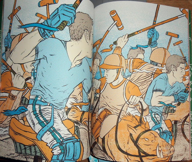
Collection of my own Nobrow magazines that I currently own. These have to be my favourite illustrative publications at the moment, as they host some of the best comic / illustrators around the world. The process in which they are produced is also interesting, as they each have their own limited colour pallet to work with and each artists work is printed with the same but alternative variations of colour.
Collection of my own Nobrow magazines that I currently own. These have to be my favourite illustrative publications at the moment, as they host some of the best comic / illustrators around the world. The process in which they are produced is also interesting, as they each have their own limited colour pallet to work with and each artists work is printed with the same but alternative variations of colour.
EMEK: Collected works of AaarghT
-
Emek is probably one of the most respected poster artists in the world, his work extends through numerous bands, musicians and solo artists. Over his years of practice, this book has collated a mass of his collected works and created one of the most influential books to my own practice. What intrigues me the most about his work is his process, as most of his screen prints have been hand created way before the art of digitally rendering. Master craftsmen indeed.
Emek is probably one of the most respected poster artists in the world, his work extends through numerous bands, musicians and solo artists. Over his years of practice, this book has collated a mass of his collected works and created one of the most influential books to my own practice. What intrigues me the most about his work is his process, as most of his screen prints have been hand created way before the art of digitally rendering. Master craftsmen indeed.
Wednesday, 8 May 2013
Tuesday, 7 May 2013
MUNKONE.2
-
Munk one again, this time a promo animation / motion graphic containing a selection of his works. Nice idea and something I could look into producing throughout some of my own briefs.
Munk one again, this time a promo animation / motion graphic containing a selection of his works. Nice idea and something I could look into producing throughout some of my own briefs.
Give Up
-
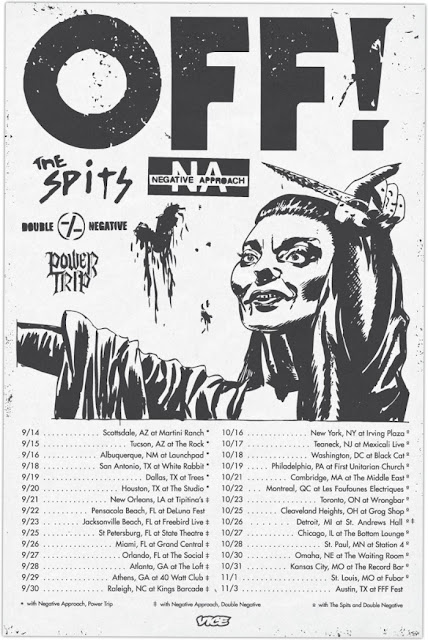
Give Up is pretty much an idol, as his approach to producing artwork, the context he basis it on and basically how his DIY punk attitude shows throughout his work, is pretty effective. This is the kind of direction I want to go with my own work and practice, as I think it will enable me to produce work for my cultural interests as opposed to just designing for boring corporate companies.
Give Up is pretty much an idol, as his approach to producing artwork, the context he basis it on and basically how his DIY punk attitude shows throughout his work, is pretty effective. This is the kind of direction I want to go with my own work and practice, as I think it will enable me to produce work for my cultural interests as opposed to just designing for boring corporate companies.
Tuesday, 30 April 2013
Tuesday, 23 April 2013
All In Merch: Product Examples
-
Spend a lot of time looking at merchandise, as most of the bands I listen to seem to have strong illustration and type driven pieces of design work that form the product range. Working with my self promo brief and album cover, I feel that this is an easy relation to the context and why I'm designing it the way I currently am.
Spend a lot of time looking at merchandise, as most of the bands I listen to seem to have strong illustration and type driven pieces of design work that form the product range. Working with my self promo brief and album cover, I feel that this is an easy relation to the context and why I'm designing it the way I currently am.
Thursday, 18 April 2013
Mike Giant - Handstyle History
-
Mike Giant is pretty much a don in the Graffiti world and also illustration, as he has applied his work to a brand called Rebel 8. Something which I need to consider with my own work. In this video he shows a number of different handstyle's and their history of origin. Important to consider when being involved within the underground culture of Graffiti.
Mike Giant is pretty much a don in the Graffiti world and also illustration, as he has applied his work to a brand called Rebel 8. Something which I need to consider with my own work. In this video he shows a number of different handstyle's and their history of origin. Important to consider when being involved within the underground culture of Graffiti.
Wednesday, 17 April 2013
Dirty Money - No Escaping This / Original Album Artwork
-
This is the original Dirty Money artwork that I will be working with to re-design and develop through the module as one of my briefs. Although I do not really find anything wrong with the current design of this, in fact I think it is pretty spot on. But I want to create something more illustrative based and effective in reaching it's purpose.
This is the original Dirty Money artwork that I will be working with to re-design and develop through the module as one of my briefs. Although I do not really find anything wrong with the current design of this, in fact I think it is pretty spot on. But I want to create something more illustrative based and effective in reaching it's purpose.
Tuesday, 16 April 2013
Dan Mumford
-
Dan Mumford's work is probably one of the most well known throughout the 'extreme' music industry. Particularly as his highly detailed and professional finish to his illustrations creates a direct visual impact relating directly with the context. As most of his work is based around digital illustration, you can clearly see how the artwork has a detailed and effective finish.
Dan Mumford's work is probably one of the most well known throughout the 'extreme' music industry. Particularly as his highly detailed and professional finish to his illustrations creates a direct visual impact relating directly with the context. As most of his work is based around digital illustration, you can clearly see how the artwork has a detailed and effective finish.
Monday, 15 April 2013
Grindesign
-
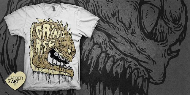
Grindesign is another big player in the record industry with his album artwork that instantly creates a huge impact. As most of his clients are based around the hardcore and metal music industry, the work he produces has a dark and foreboding feel from instant glance. An approach I need to take within my own work.
Grindesign is another big player in the record industry with his album artwork that instantly creates a huge impact. As most of his clients are based around the hardcore and metal music industry, the work he produces has a dark and foreboding feel from instant glance. An approach I need to take within my own work.
Friday, 1 February 2013
Godmachine
-
Once again I'm blogging Godmachine as contextual reference for my upcoming briefs. The video below shows a process called dry point printing, similar to lino print. The end result is pretty crisp, particularly as his choice of stock increases the visual output. Again his digital works are always impressive. A definite inspiration throughout my entire creative career.
Once again I'm blogging Godmachine as contextual reference for my upcoming briefs. The video below shows a process called dry point printing, similar to lino print. The end result is pretty crisp, particularly as his choice of stock increases the visual output. Again his digital works are always impressive. A definite inspiration throughout my entire creative career.
Subscribe to:
Posts (Atom)


