Showing posts with label Brief 5 - Context. Show all posts

Monday, 20 May 2013

OFF! Tour Poster

-
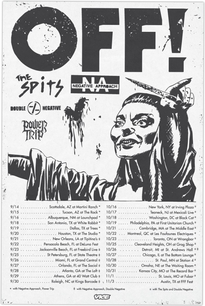
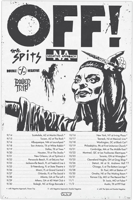
OFF! tour poster which I found on Juice magazines website. Instantly I love the overal visual impact and the punk aesthetic that fits directly with the bands culture and context. The imagery is pretty gnarly and the text below sits nicely on the bottom of the poster.


Mr.Thoms

-
Mural based work by Mr.Thoms, although his work is similar to a lot of artists around the main difference to his work is where he places it. The images below showcase how the environment itself has been adapted to his illustrations. Rather than making the image fit, the wall space has been incorporated. Something that I find interesting.


Straw Castle

-
Sumbled across Straw Castles work the other week and was instantly impressed by his attention to detail and his biography on the website. It's always interesting to see how someone else has gone about building a platform for themselves by being an illustrator. What I particularly like about his work is the strong visual colour and strokes that build up his fina imagery.


Saturday, 18 May 2013

Nobrow Collection

-
Collection of my own Nobrow magazines that I currently own. These have to be my favourite illustrative publications at the moment, as they host some of the best comic / illustrators around the world. The process in which they are produced is also interesting, as they each have their own limited colour pallet to work with and each artists work is printed with the same but alternative variations of colour.


American Hardcore

-
American Hardcore by Steve Blush is probably one of my favourite books from all time. Linking back to my dissertation, this book was the driving force to my research studies and further understanding within the hardcore subculture. The layout is something that also intrigues me as the type expands across the entire page, with images that have been 'text wrapped'. This in my eyes relates aesthetically to a traditional punk zine.


Wednesday, 8 May 2013

Danelo

-
Danleo is probably one of the best illustrators / artists around. His imagery consists of a lot of nature based elements and overall quality is incredible. I like his strong use of subtle colours an heavy lines containing the image. A possible route to experiment with in my own work.


Tom Gilmour

-
Tom Gimour, definitely smashes it in the world of tattoo styled illustrations. His symmetry and finished quality is second to none. As his work is based around black and white, makes it visually effective as there is no need for colour to define any of the features within artwork.


Tuesday, 7 May 2013

MUNKONE.2

-
Munk one again, this time a promo animation / motion graphic containing a selection of his works. Nice idea and something I could look into producing throughout some of my own briefs.

Give Up

-
Give Up is pretty much an idol, as his approach to producing artwork, the context he basis it on and basically how his DIY punk attitude shows throughout his work, is pretty effective. This is the kind of direction I want to go with my own work and practice, as I think it will enable me to produce work for my cultural interests as opposed to just designing for boring corporate companies.


Funeral French

-

Strong, bold and highly detailed illustrations by French and also products which contain his design work. Likewise with Give Up I think they both have similar values and interests within hardcore / metal and punk culture.


Tuesday, 23 April 2013

All In Merch: Product Examples

-
Spend a lot of time looking at merchandise, as most of the bands I listen to seem to have strong illustration and type driven pieces of design work that form the product range. Working with my self promo brief and album cover, I feel that this is an easy relation to the context and why I'm designing it the way I currently am.


Friday, 19 April 2013

FMP - Defined Briefs

-
Defined and edited briefs for the FMP. I needed to go through these and make sure they make sense, otherwise my project work won't relate to the aims and intentions of the brief.


Thursday, 18 April 2013

Mike Giant - Handstyle History

-
Mike Giant is pretty much a don in the Graffiti world and also illustration, as he has applied his work to a brand called Rebel 8. Something which I need to consider with my own work. In this video he shows a number of different handstyle's and their history of origin. Important to consider when being involved within the underground culture of Graffiti.

Wednesday, 17 April 2013

MUNKONE

-
Munkone is probably one my favourite poster artists / illustrators around. The way in which he combines colour with his artwork is impressive to say the least. Overall there is a strong visual consistency within colour, type and image. Possible direction and inspiration to take within my own work.


Katerina Murysina

-
Manipulated portraits and pattern work by Katerina Murysina, visually powerful and just overall nice to look at.


Jon Fox

-
Instantly these images are extremely powerful and complex in composition. Jon Fox has mastered a craft in this field of illustration / art. What I like the most about these pieces is the overall quality and the effective use of colour that demonstrates the force and dynamics within the imagery. Something to consider throughout my own illustration.


Nychos

-
Nychos is probably one of my favourite artists around at the moment as his powerful imagery and motivation to produce artwork that is visually impacting is impressive. He uses elements of anatomical scientific drawings combined with characterised illustrations and murals. 


Monday, 15 April 2013

Job Wouters HOME Mural

-
Another piece of work by Job Wouter (Letman) this time focussing on a mural installation rather than printed pieces of work. The process he takes to create the letterforms is pretty amazing, especially the method of creating gradient colour with each stroke he takes to form the word HOME.

Thursday, 4 April 2013

Doze Green

-
Another one of my favourites  Doze Green. I've blogged his work for pretty much every module during my degree. Purely because of how detailed and striking his illustration / painting technique is. The overall form of the characters is humorously morbid, as they seem to bend most of what could be called human features. A definite inspiration.


Tuesday, 2 April 2013

Conzo Throb

-
Humorous and simple character illustrations by London based artist Conzo Throb. In my opinion he is pretty big on the style and approach he use to create imagery. What I particularly like about the images below is the attention to detail and minimal use of colour, creating illustrations that are extremely effective.