Showing posts with label Brief 1 - Context. Show all posts

Monday, 20 May 2013

Mr.Thoms

-
Mural based work by Mr.Thoms, although his work is similar to a lot of artists around the main difference to his work is where he places it. The images below showcase how the environment itself has been adapted to his illustrations. Rather than making the image fit, the wall space has been incorporated. Something that I find interesting.


Straw Castle

-
Sumbled across Straw Castles work the other week and was instantly impressed by his attention to detail and his biography on the website. It's always interesting to see how someone else has gone about building a platform for themselves by being an illustrator. What I particularly like about his work is the strong visual colour and strokes that build up his fina imagery.


Saturday, 18 May 2013

Nobrow Collection

-
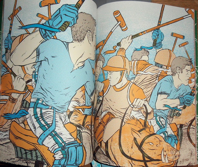
Collection of my own Nobrow magazines that I currently own. These have to be my favourite illustrative publications at the moment, as they host some of the best comic / illustrators around the world. The process in which they are produced is also interesting, as they each have their own limited colour pallet to work with and each artists work is printed with the same but alternative variations of colour.


Wednesday, 8 May 2013

Danelo

-
Danleo is probably one of the best illustrators / artists around. His imagery consists of a lot of nature based elements and overall quality is incredible. I like his strong use of subtle colours an heavy lines containing the image. A possible route to experiment with in my own work.


Tuesday, 7 May 2013

MUNKONE.2

-
Munk one again, this time a promo animation / motion graphic containing a selection of his works. Nice idea and something I could look into producing throughout some of my own briefs.

Wednesday, 17 April 2013

Nychos

-
Nychos is probably one of my favourite artists around at the moment as his powerful imagery and motivation to produce artwork that is visually impacting is impressive. He uses elements of anatomical scientific drawings combined with characterised illustrations and murals. 


Thursday, 4 April 2013

Doze Green

-
Another one of my favourites  Doze Green. I've blogged his work for pretty much every module during my degree. Purely because of how detailed and striking his illustration / painting technique is. The overall form of the characters is humorously morbid, as they seem to bend most of what could be called human features. A definite inspiration.


Tuesday, 2 April 2013

Conzo Throb

-
Humorous and simple character illustrations by London based artist Conzo Throb. In my opinion he is pretty big on the style and approach he use to create imagery. What I particularly like about the images below is the attention to detail and minimal use of colour, creating illustrations that are extremely effective.


Saturday, 30 March 2013

Mr.Gauky

-
One of the best digital artists around in my eyes, Mr.Gauky effectively applies colour and characterised illustrations together. His overall application to using strokes combined with colour is something I want to try and focus on within my own illustrative practice throughout the module.


Sunday, 3 February 2013

Rungs in a Ladder: Jacob Bannon of Converge

-
Inspiring short documentary on Jacob Bannon. One of the most renowned vocalists, in the hardcore scene. Throughout the video he speaks about some of the aspects to his life that have led him to some of the decisions he has made, where it has led him to and what keeps him motivated. He shows a clear representation of hard work, and ultimately it paying off.

Friday, 1 February 2013

Stohead

-
Stohead utilising the underground art form of graffiti, but placing it into a new context. Focusing on typography and environmental graphics. This method of utilising urban spaces, alongside bold, hand drawn type work is a possible route to take with expanding one of my briefs range. Thinking about the bigger picture.


Ged Palmer

-
Posting more of Ged Palmer's work. This is probably the best piece of work I've seen of his, particularly the combination of blackletter and script typography. Possible route to explore throughout my YCN greetings card brief.


Houxo Que

-
Came across this robotic formed visual by Houxo Que and instantly found it quite striking. Using ultra-violet light to project an extra depth to the paint used creates a mixed media approach to producing artwork. Possible direction to take with the YCN brief.


Tuesday, 29 January 2013

Ged Palmer

-
Ged Palmer, another one of my favourite designers. Particularly as he specialises in the creating hand rendered type for logos, and various other projects. The images below have been created for an identities of different companies. Each holding an impact that existing type design would not produce.


Heart Studio

-
Heart Studio produce some of the best print based illustrative work I have ever seen. Although this time I am looking more at their work that involves a direct relation with image and type as a piece of design. The logo's below, show an interesting form of textural depth an balance. Particularly as there is a more raw finish to their work, showcasing it more as hand drawn rather than the crisp digital outcomes or most design around today.


Jon Contino

-
Jon Contino, or should I say 'Don' Contino, has to be one of my favourite craftsmen purely for his dedication and approach to creating pieces of design work. Previously I have blogged him on my Design Context, but I can now relate him again to my research for my FMP. Anyway, there is nothing better than creating with your own hands. This logic can be easily recognised across his work. Something which I want to capitalise on throughout my upcoming projects.


Seb Lester

-
Hand drawn, script typography by Seb Lester. Looking at various projects a pieces of work the three below are my favourite. Particularly the amount of detailed created through the use of curved lines framing the typography together. This approach to typography seems to be the most appealing to myself and also the project I working on for YCN as it increases the personal touch, likewise the context of a greetings card.